Once, I set out to write backend-based analytics for mataroa.blog.
It was terrible. Slow, complex, ugly. Then, I rewrote it. It turned out great. I really like its simplicity and elegance.
This is where I explain how.
Mataroa is written in Python using Django, and the following snippets are from commit hash 7b6e5da84b8a93e9af37545b16a6ec2f874be97e.
Django Model
class Analytic(models.Model):
    post = models.ForeignKey(Post, on_delete=models.CASCADE)
    created_at = models.DateTimeField(auto_now_add=True)
    referer = models.URLField(blank=True, null=True)
The above is the model that stores the analytics. It's a single model, with a foreign key to post. Each model object, which is a table row, is one visit for one particular post.
As far as deletion strategies, we opt for cascade, as we don't want to have analytics of a post that has been deleted.
The created_at field / column is the timestamp of when the visit was registered. We enable auto_now_add, which essentially fills the timestamp in when the object is created. Exactly the purpose of a created_at column.
Final field, the misspelled referer. I considered omitting it, in the name of no tracking. Eventually, I decided it's ok because of minimal tracking capabilities as the IP is not logged.
Logging analytics
To log a new analytic we inject this into the post detail view:
referer = None
if "HTTP_REFERER" in self.request.META:
    referer = self.request.META["HTTP_REFERER"]
models.Analytic.objects.create(post=self.object, referer=referer)
It includes a check for the referer HTTP header. If it exists, add it. If not, keep it None. Also, in case of the user being logged in, we do not log a visit:
if (
    self.request.user.is_authenticated
    and self.request.user == self.object.owner
):
return context
Showing analytics
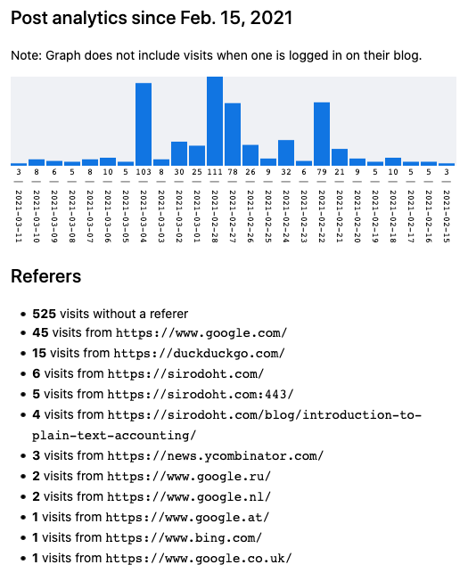
Showing the analytics to the user was the funnest part of this feature. Usually, one chooses a chart JavaScript library and feeds the data from a JSON endpoint. But, not at mataroa! To enjoy true craftsmanship, I wrote an SVG graph from scratch while also utilising the Django template loop.
<svg version="1.1" viewBox="0 0 500 192" xmlns="http://www.w3.org/2000/svg">
    <rect y="100" height="100" width="500" style="fill: #fff;"></rect>
    {% for day, analytic in post_analytics.items %}
    <rect
        x="{{ analytic.x_offset }}"
        y="{{ analytic.negative_count_percent }}"
        width="18"
        height="{{ analytic.count_percent }}"
        class="analytics-chart-bar"
    >
        <title>{{ analytic.count }} hits during {{ day|date:'F j, Y' }}</title>
    </rect>

    <text
        x="{{ analytic.x_offset|add:'9' }}"
        y="108"
        text-anchor="middle"
        dominant-baseline="middle"
        class="analytics-chart-text"
    >
        {{ analytic.count }}
    </text>

    <text
        x="115"
        y="-{{ analytic.x_offset|add:'9' }}"
        transform="rotate(90)"
        dominant-baseline="middle"
        class="analytics-chart-text"
    >
        | {{ day|date:'Y-m-d' }}
    </text>
    {% endfor %}
</svg>
It's a bit complex. Let's break it down.
The first line defines the svg object in a container of 500px width and 192px height:
<svg version="1.1" viewBox="0 0 500 192" xmlns="http://www.w3.org/2000/svg">
Then, we define a white background for the dates labels. This should be below the actual analytics graph:
<rect y="100" height="100" width="500" style="fill: #fff;"></rect>
Then, we do a loop on each analytic object. Each object represents the number of visits per day. It contains a rectangle, which is the column, and then the number of visits, and the date. Each post_analytics item contains:
x_offset: How right the column (rectangle) will be.negative_count_percent: How much down each column (rectangle) will be.count_percent: The max height for a column is 100px. The height is the percentage ratio of this visit divided by the number of visits of the day of the most visits (i.e. most analytics).count: The absolute number of visits for this day, for this post. A positive integer.
We use the above to create the column of the graph. Then, we create labels below each column, which are read vertically.
The first text element is the number of visits, and the second is the date. Positioning in this case is stacked. If something exists in x = 0, and has width 9 pixels, the next one will start from x = 10 onwards. But, in our case, we want to have a little bit of margin too. This is the reason we use the Django template filter add:'9'. We want to move the next text a further 9px to the right.
For the date element, we also do a 90° rotation so that each line fits in the 9px width of a single column. And, the fixed point, around which the whole line turns, is the middle. We define this with the property:
dominant-baseline="middle"
We, now, have a minimal, beautiful (IMHO at least), and more importantly simple graph that visually takes across the information we want. All that with a few hundred bytes.
Calculating analytics
The last piece of the puzzle is how we generate the view variables that we pass on to the front-end.
It might be obvious that we need to do some SQL aggregations. I was quite convinced that I would end up with raw SQL for this one, but the beautifully designed Django ORM did not fail to deliver once again.
By utilising features such as annotate and Count, I managed to get the same performance with what I'd write as raw SQL.
We get the full data of 25 days of analytics for one post like so:
date_25d_ago = timezone.now().date() - timedelta(days=24)
day_counts = (
    models.Analytic.objects.filter(
        post=self.object, created_at__gt=date_25d_ago
    )
    .values("created_at")
    .annotate(Count("id"))
)
Then, we needed to transform the above, so that we have all the required numbers to draw the SVG shapes.
First, we transform the counts for each day into a dictionary with date as key. At the same loop, we find the day with the most analytics. We want to use this max number of visits as the 100% column of our graph.
count_per_day = defaultdict(int)
highest_day_count = 1
for item in day_counts:
    count_per_day[item["created_at"].date()] += item["id__count"]

    # find day with the most analytics counts (i.e. visits)
    if highest_day_count < count_per_day[item["created_at"].date()]:
        highest_day_count = count_per_day[item["created_at"].date()]
Then, we calculate the counts and percentages we need for each day.
- We normalise each analytics count as a percentage.
- If it's 0, we re-write to 1px, so that it's visible in the graph.
- Each column has 18px width, plus 1px on each side as margin.
current_date = timezone.now().date()
while date_25d_ago <= current_date:
    # normalize day count to percentage for svg drawing
    count_percent = 1  # keep lowest value to 1 so as it's visible
    if highest_day_count != 0 and count_per_day[current_date] != 0:
        count_percent = count_per_day[current_date] * 100 / highest_day_count

    context["post_analytics"][current_date] = {
        "count": count_per_day[current_date],
        "x_offset": current_x_offset,
        "count_percent": count_percent,
        "negative_count_percent": 100 - count_percent,
    }
    current_date = current_date - timedelta(days=1)
    current_x_offset += 20
The negative_count_percent is 100 - count_percent, because the SVG positions stars counting from above. So, for example, if our column is 10px tall, we want it to start from 90px down, so that it finishes at 100px (as it has 10px height). In this way, every column's lower edge is aligned.
Referers
We aim for simplicity as far as the referers are concerned, too. We retrieve them in aggregate:
context["referers_count"] = (
    models.Analytic.objects.filter(
        post=self.object, created_at__gt=date_25d_ago
    )
    .values("referer")
    .annotate(Count("id"))
    .order_by("-id__count")
)
And render them in a template like so:
{% for rc in referers_count %}
{% if rc.referer is None %}
<li><strong>{{ rc.id__count }}</strong> visits without a referer</li>
{% else %}
<li>
    <strong>{{ rc.id__count }}</strong>
    visits from
    <span style="font-family: monospace;">{{ rc.referer }}</span>
</li>
{% endif %}
{% empty %}
<li><i>No visits</i></li>
{% endfor %}
Epilogue
I remember looking at a very similar graph in sourcehut, but I can't find it now. That was definitely the primary source of inspiration. Along with the conviction that writing SVG myself is not illogical.
PS. Since writing this post, referrer logging has been removed from mataroa, following the change of the default referrer policy by Firefox and Chrome.